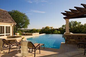
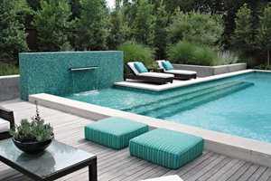
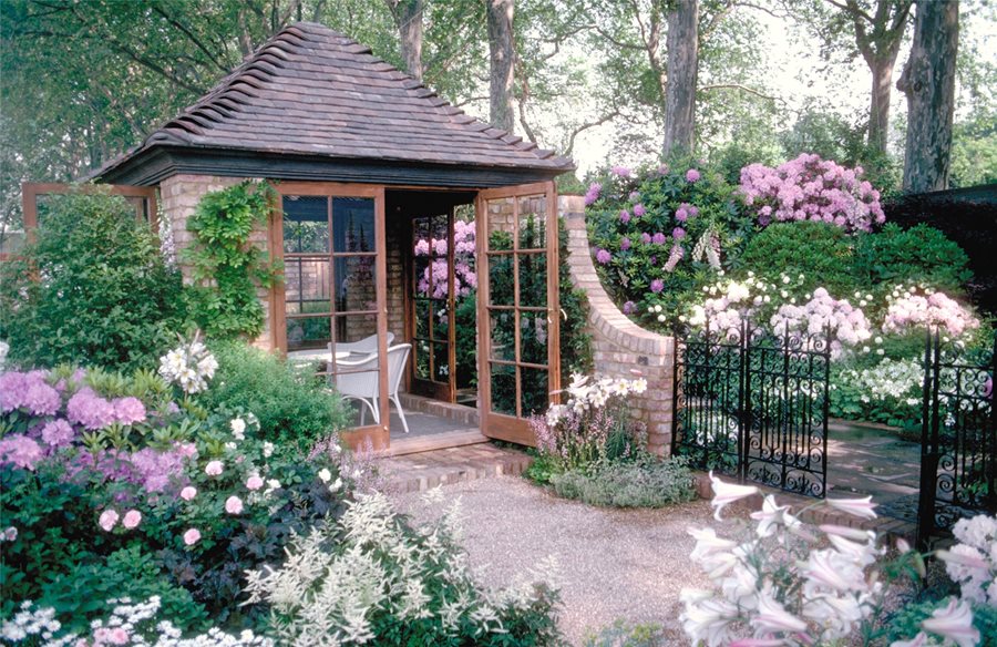
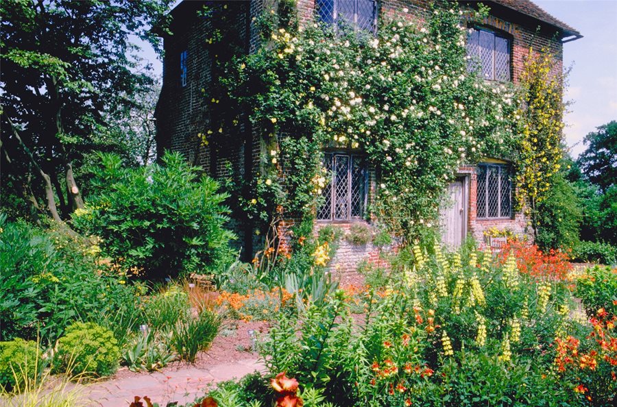
Backyards
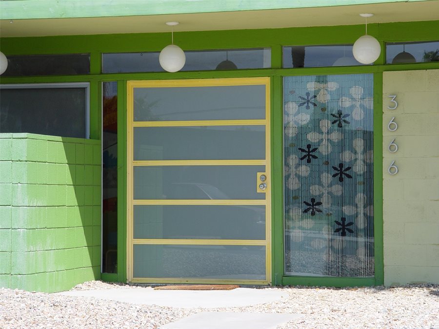
 Front Yards
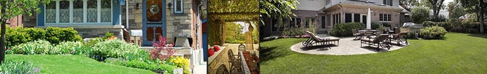
Evaluating Color Use in Landscape Design
5 ways to determine the best color palette for your garden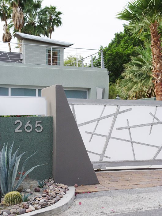

Contemporary landscape design is a celebration of color. Its hues may be integrated into the hardscape, contributed by accessories and decor, and above all, it is represented in the planting plan. Your landscape is much like an Impressionist painting, where color sets the mood in a very subtle way. The palette created by you and your designer becomes an overriding theme throughout the project. It guides the decisions and furthers your design goals, manipulating color applications to create an ideal character for your house exterior, its outdoor living spaces and the garden.
To better work with your designer, it's important to understand a few basics about how she sees colors relative to one another. To do so, you must begin with the color wheel, which is the basis for theories of color based relationships.
Sometimes picking a color palette can seem daunting. Here are four techniques for choosing the best colors for your garden.
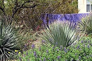
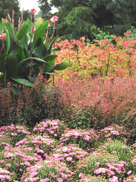
Analogous colors
Colors on the wheel that are located next to one another are considered analogous. These are colors that easily blend into one another. They were utilized by Impressionist Claude Monet in many of his paintings of gardens. An entire canvas may be painted largely in red and pink, which are analogous colors. He also did the same with blues and purples in his lily pond paintings. A landscape composed with an analogous palette will appear peaceful and fluid, projecting an overall sense of harmony.
Complimentary colors
Colors opposite one another on the color wheel are complimentary. These are bold, powerful pairings that lend a vibrant dynamic. When complimentary colors are used together the human eye picks up a visual vibration where they meet. The Christmas colors, red and green, are a good example. We love them to liven up the dark winter days, but we rarely utilize them in clothing due to this same vibration. Impressionists Vincent Van Gough and Paul Gaugan were masters at utilizing complimentary colors. This vibration is what makes their paintings so visually exciting. When complimentary colors are used creatively in a landscape, it becomes festive and stimulating as decor, walls and plants literally pop with intensity.
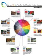
Using certain colors in your landscape design can create specific moods. For example red usually suggests excitement and blue is typically calming. Use this infographic to learn what color pairs to use for setting the mood you desire.
Hot colors
Colors are grouped by temperature. Hot colors are red, yellow, orange, which in the landscape can be vibrant and alive. Vita Sackville West, the late great gardener of England created a whole garden of these sunset hues to provide a sense of warmth to the cool damp climate. These are powerfully present hues where a little bit goes a long way. Modern designers know how powerful a wall or a door or another accent can be when painted in a hot color to make it stand out from the rest of the landscape. Modern sculptor Alexander Caulder was in love with red and used this hue to make his metal sculptures more visible in a room or landscape.
Bipolar Grey
Grey is an important color for modern design. It is created when white is mixed with a darker color. The darker color dictates whether a grey is part of a cool palette or a warm palette. Cool grey is created with white and blue. Warm gray is created with white and red.
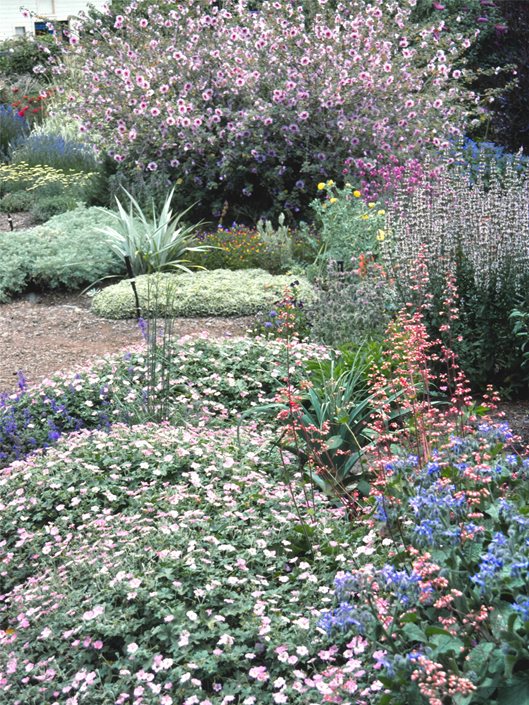
Cool colors
Blue, green, white, soft pinks and pale yellows are all considered cool colors. They are very subdued and constitute some of the most valued hues for hot climates. Cool colors are stately and sophisticated, heavy on the pastel hues that create a very feminine feel overall. These colors are the most commonly used in the past because they are safe. Among older or more traditional enclaves, the use of hot colors is considered poor taste.
Color value
Value is a term used to describe the intensity of a color. The best example of this is a black and white photograph that shows the image in shades of grey. The varying degree of light and dark is what creates the image. The same applies to color intensity. When choosing bold colors to use in the hardscape, value is very important. Too much value may spoil a subtle design accent, while the same color in a lighter value can fail to assert itself. These subtle differences are what designers struggle with to find the exact hues and values for the desired effect.
A painter's palette contains all the colors she will use in a painting. Creating a palette for your landscape helps to determine the color theory of your project in advance, so that the selection of plants, materials, accents and trim is coordinated. Use paint chips from the home improvement store to gather colors that appeal to you. Mix and match them to create a selection of hues to guide your designer's hand in selecting plants and finish materials.